Here's a full review from Paul Lukas at Uni watch which I copied for you fine people. The Yes Yes, No No, refers to the mesh on the abdomen which Paul calls the sweatbox as it changes colour during games due to the player sweating and the Flywire collar which he calls the Nikelace, because he couldn't think of anything better. I would have just put a link but Uni Watch is a blog and things get lost as the page extends. I have pruned out some pieces of text which I feel are not consistent with our needs.
Now that I’ve had a bit of time to comb through all the small details, here’s a comprehensive team-by-team breakdown:
Team Sweatbox? Nikelace? Notes
Bears Yes Yes TV numbers moved from the sleeves to the shoulders, so the stripes have more room to breathe and the George Halas perma-memorial is bigger. I'm fine with this.
Bengals Yes Yes The two-tone collar actually works for this team, because it plays into the uniform's overall stripey-ness. ... Pants striping now wraps around more toward the front, which I think is actually an improvement.
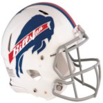
Bills Yes Yes New two-tone collar makes it look like everyone's wearing a neck roll. … Note that the sleeve swooshes are positioned above the sleeve stripes, instead of below -- a big improvement over the old set-up, because now the sleeve stripes can come down to where they belong and be more horizontal, instead of diagonal. ... Hip logo appears to be lower than before.
Broncos Yes Yes Really hate the way to the points of the new two-tone collar nearly touch the points of the collarbone horns.
Browns Yes Yes Essentially unchanged. ... Somewhere in the Nike offices, there's probably an exec whose sole job is to convince the Browns to adopt a helmet logo.
Buccaneers Yes Yes Shame about the new two-tone collar. ... Nike press notes say the Bucs are sticking with the old pants technology, because "they like their old pant had nave chosen to keep it." But it looks like they're going with the new mesh striping, so either the press notes are wrong or the mannequin was wearing a prototype that won't actually be worn by the players. Hmmm.
Cardinals Yes Yes Black outlining that used to completely encircle collar now just wraps around part of collar, which is addition by subtraction. ... Has to annoy Nike that they're manufacturing this Reebok-template design.
Chargers Yes Yes Another two-tone collar will make the whole team look like they're wearing neck rolls.
Chiefs Yes No TV numbers have been moved from the sleeves to the shoulders. In theory, I'm fine with this; in practice, the sleeve striping they're now going with is way too thin. Needs more oomph.
Colts Yes Yes Essentially unchanged, but couldn't someone have fixed those shoulder stripes? ... Hmmm, striped socks or solid-top socks? I'm trying to find out which version is correct.
Cowboys Yes Yes Press notes say, "Color consolidation in the pant (3 blues to 1 consistent blue)." Aside from that, essentially unchanged. ... Pants still look metallic. ... Note that Dallas is one of the few teams whose pants striping is not interrupted by the padded belt tunnels. Not sure if this will be a team-wide thing or a player-by-player thing.
Dolphins Yes Yes Home uni essentially unchanged; road jersey has two-tone collar -- ugh.
Eagles No No Essentially unchanged, even in the tailoring, construction, and fabrication. ... From the press notes: "No innovation taken. Color matching issues." Who knew midnight green would prove to be such a challenge to reproduce in high-tech fabrics?
Falcons No No Essentially unchanged, even in the tailoring, construction, and fabrication. Bit of a shocker for such a newfangled-looking team, no?
49ers Yes Yes Press notes say, "Sleeve stripes are now horizontal to the field of play." Maybe so, but they're still a disaster. ... Gold pants are now more of a matte mustard.
Giants Yes Yes Gray pants with red-blue-red striping, previously worn only on the road, will now be worn for all games -- I heartily approve. ... Joe Skiba video posted on Giants.com yesterday provides a glimpse of a red alternate. ... Helmet on mannequin didn't have a front uni number, but I'm assuming this was just an oversight, not a design change.
Jaguars Yes Yes I'll never forgive them for ditching their original design, which was a thing of beauty, but at least this version is better than Reebok's super-stretchy rendition. ... Hip logo looks bigger. ... Black alternate supposedly in the works.
Jets Yes Yes Essentially unchanged. ... First wardrobe malfunction of the Nike era: Shonn Greene's TV numbers were falling off at Tuesday's unveiling.
Lions Yes Yes Press notes: "Different version of stretch woven fabric on pant to accommodate color." Not sure what that means, but the pants look much less metallic than before -- more of a matte gray.
Packers No No Essentially unchanged, even in the tailoring, construction, and fabrication.
Panthers No No Essentially unchanged, even in tailoring and construction, except for the new helmet logo that was unveiled a few months ago. ... Silver pants still look silver. ... Press notes make a big fuss of saying that the new logo "came from NFL design (not Nike)." Guess that's Nike's way of saying, "If you don't like it, don't blame us." ... Hip logo appears to be lower than before. ... Jersey apparently has some slogan on the inner collar, but that's just a retailing gimmick, which is of no interest to me. ... Road and alt jerseys, also unchanged, are shown here. ... Hip logo looks lower than before. Also kinda looks like the logo cat is snarling at the swoosh.
Patriots Yes No Silver pants are now more of a matte gray. ... Otherwise, essentially unchanged.
Raiders No No Essentially unchanged, even in tailoring, construction, and fabrication.
Rams Yes Yes New two-tone collar ruins an otherwise fine jersey. … According to Jim Thomas of the St. Louis Post-Dispatch, no more gold pants. If so, that's a tragedy -- the Rams' white jersey with gold pants was one of the best looks in the league.
Ravens Yes Yes New two-tone collar looks like shite. ... Hip logo appears to be lower than before.
Redskins Yes Yes Essentially unchanged. ... New alternate reportedly in the works.
Saints Yes Yes New two-tone collar should have a bounty put out on it. ... Really wish they'd put the gold pants on the mannequin, just so we could see how metallic they are.
Seahawks Yes Yes Complete overhaul. Too much to deal with here. I'll provide a full assessment of it in a few days.
Steelers Yes No Essentially unchanged. ... 80th-anniversary logo, unveiled earlier this week, does not appear as a jersey patch. Maybe it'll be added later..? ... Helmet on mannequin did not have a front uni number, à la the team's preseason look. I assume this was just an oversight, not design change.
Texans Yes No Is that collar on steroids or what? Didn't look so thick before.
Titans Yes Yes Essentially unchanged.
Vikings Yes Yes Didn't think they could make this design any worse, but I hadn't figured on the two-tone collar. Woof!
• First, here’s something I mentioned in yesterday’s ESPN column but didn’t illustrate with a photo: In the past, pants piping has been added in the form of stretch insert panels. But now they’re going with mesh inserts, for better ventilation. Not sure how visible this will be on TV. I initially spotted only one exception to this new format: the Packers, who appear to be using the traditional stretch panel (that’s particularly interesting because last year several Green Bay players said they really liked the team’s throwback pants because they didn’t have striping and were therefore more comfortable). After going back over my photos, it now appears that the Raiders, Panthers, and Eagles may be sticking with the old striping panels as well.
• The NFL Equipment shield, which had appeared on jersey collars and pant thighs is gone. Now it’s just the NFL logo. And as you can see in that shot, the logo is now a little plastic chip, not a woven patch like they’d used in the past.
• For teams that have chest logos or wordmarks, those marks appear to be riding lower than ever.
• Get ready for a lot of glove silliness.
• When Nike outfitted several NFL teams back in the ’90s, the swoosh on the right sleeve always faced to the left. This is because the Nike style guide has always specified that the swoosh must be left-facing except when used on the right side of a shoe. But that guideline has apparently been rewritten, because the right-sleeve swooshes on the new uniforms are facing rightward.
• The mannequins at the unveiling were all wearing two-tone shoes in team colors: At first I thought these were just for display. But Giants equipment manager Joe Skiba tells me that all players can now wear team-colored shoes, although they have the option of sticking with white or black. So the longstanding rule mandating predominantly black or white footwear has apparently been scrapped (I’m trying to get league confirmation on this). This is basically the same thing the NBA has done. Of course, many players have shoe contracts with companies other than Nike, so it’s it’s gonna be a real crazy quilt out there on the footwear front.
• As you’ve probably noticed, only home jerseys were on display. Not sure why. I have no reason to think there’s anything secretive going on regarding the road jerseys, however.
• I’m told that several teams have alternate jerseys that will be unveiled later on. (Specifically, I overheard Brian Orakpo of the Redskins saying that the ’Skins have an alternate in the works. He said he hadn’t seen it yet, but his comments suggested that it might be black. We shall see.)
• Lighter, faster, drier, cooler, blahblahblah Nobody cares. At one point a Nike exec even bragged that the D-rings in the belts were made of “airplane-grade aluminum.” I guess that means the players can now fly. Or the belts can fly. Or something.
• Possibly the best thing about the entire Nike contract: The uniform template they’re using for the NFL is called the Elite 51. There’s nothing particularly remarkable about that name, except it means we won’t have to keep hearing “Pro Combat” every five minutes. A huge relief.