Billsfan
Admin

Posts : 4773
Join date : 2007-08-26
Age : 53
Location : Kent, England
 | | Subject: Vikes and Dolphins Fri May 03 2013, 22:59 | |
| I think it speaks volumes as to the damp squib both the Dolphins and Vikings new uni's have been that there's not been much chat here about them. To be honest I have been disappointed with them both. The Vikings is, well just plain dull and Miami's doesn't fill me with excitement either. What's with the Matt paint on the Vikes helmet!?! I hate it on cars and it don't look any better on a football helmet. I suppose we can be thankful it's no two tone like the nasty Jags one. The jersey is uninspiring,when Nike got the contract and after the Seahawks uni's last year I thought we would see some innovation. maybe the teams are holding Nike back, I don't know. What's with the horrendous font for the numbers? It sort of works when the second number slots into it like 28, but have you seen it when there's a double number like 22? Awful. The sleeve stripes are boring, why it gets wider on the rear of the sleeve is a mystery to me, they look nothing like the Viking ship and if that was the case they should be in the front. What's your take, do you like it? 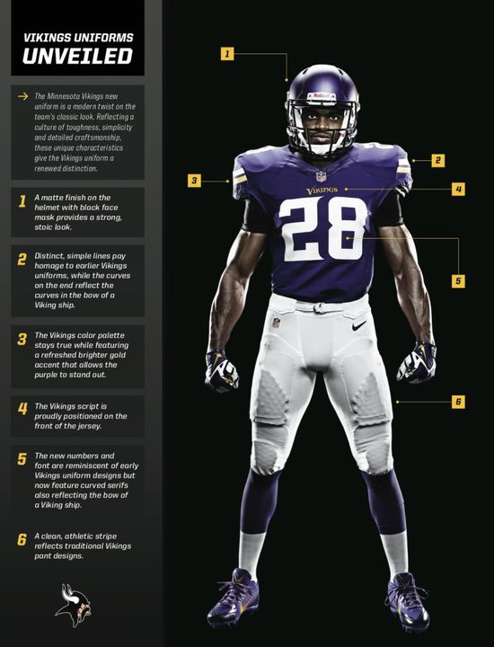  And now to Miami, as a division rival to my beloved Bills, I've never much cared for the Phins. This new logo is kinda cute. That's ok if you are going to Disneyland, but the NFL? Now Dolphins are cute and not terribly vicious so making flipper more awe inspiring is a difficult one, but I would have been tempted to leave it as is and just update the uni. That said the uni is only marginally better than the Vikes. The font is not the best and having 'MIAMI' written across your butt, sort of embarrassing. Lay it on me, tell me what you think. 
Last edited by Billsfan on Sun May 05 2013, 17:41; edited 1 time in total | |
|
nfloldham
Hall of famer


Posts : 406
Join date : 2011-01-11
Age : 31
Location : Oldham
| | Subject: Re: Vikes and Dolphins Sat May 04 2013, 00:39 | |
| I actually like the Vikes jerseys, they remind me of the throwback jerseys. I'm tempted to buy an AP jersey | |
|
sluggermatt15
Starter

Posts : 104
Join date : 2012-09-12
| | Subject: Re: Vikes and Dolphins Sat May 04 2013, 13:46 | |
| I don't mind the Vikings design. To me it just looks like a more modernized version of their current Nike's. The sleeve stripes are a little different but that's all right.
The Dolphins uniform looks too plain! I am also not a fan of "DOLPHINS" on the front. The font is too big. What happened to the cursive style? IMO the team should go back to that. | |
|
LASER___SHOW
Probowler


Posts : 229
Join date : 2008-08-02
Age : 34
| | Subject: Re: Vikes and Dolphins Sat May 04 2013, 17:25 | |
| I'm not a fan of the Dolphins jersey but I do like the Vikings one, It does look very similar to their Throwback jersey. | |
|
Chris2k
Moderator

Posts : 1050
Join date : 2010-09-02
Age : 45
Location : New York, USA
| | Subject: Re: Vikes and Dolphins Sun May 05 2013, 14:52 | |
| Yeah, I kinda dig the Vikings. The Jaguars and Dolphins are horrible. | |
|
finfan1uk
Probowler
Posts : 221
Join date : 2007-10-15
Age : 46
Location : Nottingham
| | Subject: Re: Vikes and Dolphins Mon May 06 2013, 09:50 | |
| I'm a bit torn about the new fins uniform.
My first impression was a bit meh....they seem a little bland and boring. However like the new logo, over time they seem to be growing on me and I'm starting to think they look simple but classy. | |
|
tmacman
Starter

Posts : 81
Join date : 2012-01-03
Location : Hastings
| | Subject: Re: Vikes and Dolphins Mon May 06 2013, 12:41 | |
| The vikings jerseys are fine, hell they'd be excellent if they hadn't have put those wavy things on certain numbers in the font.
Now the dolphins jerseys aren't that bad, but they're not that good. I find that they're a subtle downgrade from the previous jerseys in most areas, with the exception of dumping the drop down shadow look on the numbers, which is an improvement. | |
|
Sponsored content
| | Subject: Re: Vikes and Dolphins | |
| |
|